Introduction
There is no one-size-fits-all visual button
When asking Claude to build an HTML page, quality rarely comes from saying "make it prettier" — it comes from which skill is invoked. ClaudeKit does not consolidate visualization into a single catch-all command. It splits into multiple narrow skills, each handling one specific job. The most common confusion is treating all of them as the same group, then receiving architecture docs that look like landing pages, or product UIs that look like internal documentation.
This piece uses a positioning map built around two axes — orchestrating thinking and executing interfaces — then applies it to a real problem: fully visualizing a plan file. In Section 03, a sample expense approval app plan is run for real; screenshots are kept as evidence, and prompts are ready to copy-paste.
One note for reading the examples correctly: in ClaudeKit, preview, frontend-design, stitch, tech-graph, and show-off are all skills invoked through natural language (prompt-driven), not CLI commands with flags to type manually.
When this post mentions a flag, it refers to a flag of an internal script the skill runs underneath — not a parameter typed alongside the slash command. An exception is the generation flags for preview such as --explain, --diagram, --slides, --html, because those are part of this skill's invocation syntax.
One more point, covered in detail in Section 02: as of the engineer@v2.20.0 stable release, --html is no longer exclusive to preview — both /ck:brainstorm and /ck:plan accept it.
01
Positioning map: /ck:preview vs /ck:frontend-design
These two skills are often confused because both can output polished HTML, both care about typography and color, and both have anti-slop rules. The difference is the output contract: preview produces documentation for teams to understand, cross-reference, and make decisions; frontend-design produces UI for end users to interact with as a product.
/ck:preview: visual orchestration
Use when you need to preview files or directories, or build explanatory documentation immediately after /ck:plan or /ck:debug. It is a relay station for topics, git context, explanations, slides, diagrams, or review dashboards.
/ck:frontend-design: interface execution
Use when the goal is a polished UI for end users. It performs best when a source design is available: a screenshot, a sample interaction video, or a detailed description.
/ck:preview --html --explain "blog i18n pipeline: from HTML source through JSON to 4 locale routes"
/ck:preview --html --slides "Astro + Turborepo monorepo architecture"
/ck:preview --diff HEAD~3
The style philosophy of preview is consistency. It selects a style from a fixed predefined preset list, rotating between generations to avoid repeating fonts and palettes. The scrollable HTML page has 6 presets: Blueprint, Editorial, Paper-Ink, Terminal Mono, Swiss Clean, Warm Signal. The slide deck has 4 different presets: Midnight Editorial, Warm Signal, Terminal Mono, Swiss Clean. One hard rule applies: every HTML page it generates must have a light/dark theme toggle as the first child of <body>. Without the toggle, the output is incomplete.
/ck:frontend-design Replicate the UI in this screenshot with HTML/Tailwind  [+ attach image]
/ck:frontend-design Order management dashboard, dense data rows. DESIGN_VARIANCE=4, VISUAL_DENSITY=8
The style philosophy of frontend-design goes the opposite direction: differentiation. Default is DESIGN_VARIANCE=8, with the goal of ensuring no two designs look alike. Three Design Dials can be declared directly in the prompt for control.
| Dial | Default | Low | High |
|---|---|---|---|
DESIGN_VARIANCE |
8 | Symmetric, centered | Asymmetric, masonry, intentional negative space |
MOTION_INTENSITY |
6 | Hover/active states only | Scroll-triggered effects, spring motion |
VISUAL_DENSITY |
4 | Generous whitespace, clean | Tight padding, monospace data, cockpit-style |
Quick routing table
| Input | Call | Why |
|---|---|---|
| A topic that needs explaining to the team | preview --html --explain "<topic>" |
Output is a readable document with Mermaid |
| A topic to present | preview --html --slides "<topic>" |
Viewport-fit slide engine |
| A git range / PR | preview --diff <ref> |
Review dashboard, reads real git data |
| A plan to cross-reference with code | preview --plan-review <plan> |
Compares plan against the actual codebase |
| Screenshot/video of a UI | frontend-design + attach |
Replicate workflow |
| A UI description + Design Dials | frontend-design |
Build production UI |
The two skills are not mutually exclusive. They operate at different stages within the same development loop: preview checks the thinking layer — for example, whether the plan matches the codebase, whether the flow is clear, what the blast radius of a diff looks like. frontend-design builds and checks the aesthetic layer of the product.
02
Satellite skill system
The two main axes from Section 01 do not stand alone. Around them is a group of supporting skills, organized into three capability clusters. Understanding these clusters enables more accurate skill selection and makes it easier to debug when something breaks.
/ck:ui-ux-pro-max shapes layout, typography, spacing, palette, and UX guidelines. This is the required foundation of frontend-design.
/ck:tech-graph outputs publish-grade SVG/PNG; /ck:mermaidjs-v11 keeps markdown diagrams syntactically correct.
/ck:markdown-novel-viewer handles the reading experience; /ck:show-off packages brief, content, HTML, screenshots, and showcase into one pipeline.
/ck:brainstorm and /ck:plan now accept --html, emitting an HTML page you can open straight in the browser instead of just a markdown file.
Cluster 1: Design intelligence
/ck:ui-ux-pro-max is the design intelligence engine. It is the required foundation of frontend-design — every workflow activates it first — and is also recommended for preview --slides. Under the hood is a BM25 search engine over a large CSV corpus: many styles, hundreds of color palettes, font pairings, product types, UX guidelines, chart types. It shapes the design token system — layout, typography, spacing — before generating any code.
A priority rule to keep in mind: when a ui-ux-pro-max recommendation conflicts with anti-slop rules — for example, suggesting Inter font or a purple palette — anti-slop rules win, unless the user explicitly requests otherwise.
Cluster 2: Architecture diagramming
/ck:tech-graph is for publishing publish-grade diagrams. The skill generates crisp SVG and PNG for embedding in posts, slides, or handoff documents. It supports 8 styles: Flat Icon, Dark Terminal, Blueprint, Notion Clean, Glassmorphism, Claude Official, OpenAI Official, Dark Luxury. Invocation is a natural-language description of the system and desired style. The skill internally runs generate-diagram.sh to validate SVG and export PNG.
/ck:mermaidjs-v11 is a syntax validator for text-based diagrams. It suits quickly building flowcharts, sequence diagrams, and state diagrams embedded directly in internal markdown, while ensuring correct Mermaid v11 syntax. preview calls this skill whenever it generates Mermaid. It is a pure reference skill and can also be used standalone.
The boundary between the three diagram skills is clear: if the diagram is a standalone image file to be used elsewhere, use tech-graph; if the diagram is embedded in markdown, use mermaidjs-v11; if the diagram lives inside an HTML explanation page, use preview --diagram.
Cluster 3: Presentation and experience
/ck:markdown-novel-viewer is the server behind preview view mode. It renders markdown into a dedicated reading page: serif, warm background, constrained width — well suited to long documents. An easily overlooked feature: it renders Mermaid directly in the reading page, including flowcharts, sequence diagrams, gantt charts, and mindmaps, with theme-aware styling and a full-width toggle.
/ck:show-off is an end-to-end pipeline from brief to social asset. A common misconception: show-off does not automatically scan existing assets in the repo and compile them into a gallery. It runs a self-contained mission: research/fact-check, write bilingual content, invoke frontend-design to build HTML, run Puppeteer to capture screenshots at multiple ratios, then output the showcase. frontend-design is just one step in that pipeline.
Group 4: Brainstorm and plan export to HTML
Until recently, --html was tied almost entirely to preview. As of the engineer@v2.20.0 stable release (shipping with ClaudeKit CLI 4.5.0), brainstorm (the skill for weighing ideas and options) and plan (the skill for laying out an implementation plan) accept the same flag too. These two used to return only markdown text; now they can also produce an HTML page you read and share right in the browser.
/ck:brainstorm --html writes the markdown first, then adds an HTML page styled like a magazine: the same decisions and evidence, but laying out the most important trade-offs, assumptions, and the final recommendation more clearly. The HTML file is a standalone page you open directly, handy to send to someone who was not in the discussion.
/ck:plan --html goes one step further: the main output is plan.html, an interactive plan page where you click through each phase and open step details in a popup, with optional technical illustrations. The notable part for this post: before building the HTML it calls /ck:frontend-design, so it also runs through the same ui-ux-pro-max design-intelligence process. The HTML page is created only after the plan has passed the red-team and validation steps, so it reflects the final plan.
/ck:brainstorm --html "pick an i18n sync mechanism for the blog: build-time inject
  vs runtime fetch vs content collection"

/ck:plan --html "add a 5th locale (ko) across the whole blog, from i18n JSON to the existing 4 routes"
Practical takeaway: brainstorm and plan do not compete with preview. preview is still the quick way to build an explanatory document from a topic or git context; --html on brainstorm and plan attaches the HTML page to the brainstorm or the plan itself that the session produced, not a separate explainer.
03
Case study: fully visualizing a plan file
The problem: Given a plan file, the goal is to visualize everything — system architecture, illustrative interfaces, and the operational flow. No single skill handles this end to end, because the problem spans two separate capability clusters: explanation & diagramming and real UI mockups.
The plan used for the case study is an internal expense approval app: 6 entities (Employee, ExpenseClaim, LineItem, Approval, Payment, AuditLog), a 5-state state machine, 5 UI surfaces. The plan has sufficient entity and action detail for the skills to infer workflow, architecture, and UI.
One clarification for correct usage: preview --explain and preview --diagram accept a topic string — they do not parse a plan file. The correct syntax is the flag placed before the topic: /ck:preview --diagram "<description>", not /ck:preview <path> --diagram.
Option 1: Fast-track (2 commands)
For when you need to validate an idea quickly and a rough draft is acceptable.
/ck:preview --html --explain "expense approval app: 5 layers from SPA down to PostgreSQL,
  state machine draft→submitted→under_review→approved→paid, 5 surfaces"

/ck:stitch "infer the UI screens for the expense approval app from the workflow in the plan;
list the screen list for me to review before generating"- Command 1 creates a self-contained HTML file: overview, ASCII quick view, Mermaid architecture flow, key concepts. Everything lives in one page with a theme toggle.
- Command 2 lets
stitchinfer the screen structure from the functional logic in the plan. The phrase "list screens before generating" is the most important checkpoint.
Option 2: Comprehensive flow (4 steps)
The full workflow for producing a design handoff package for clients or project documentation. Below are the real results of each step.
architecture
approval queue
state machine
showcase
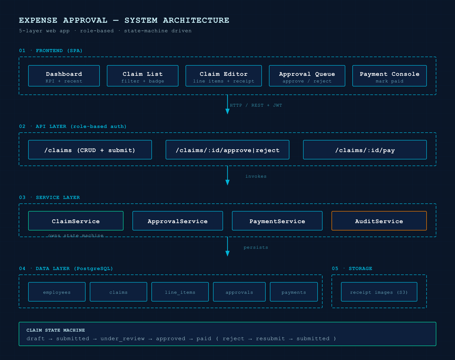
Step 1: Architecture diagram with tech-graph
/ck:tech-graph Architecture diagram for the expense approval app: 5 layers Frontend (5 screens) →
  API (role-based) → Service (ClaimService owns state machine, Approval, Payment, Audit)
  → Data (PostgreSQL) + Storage (receipts). Blueprint style.
The skill writes SVG using the Blueprint preset: dot-grid background, mono, cyan accent. It then validates and exports a publish-grade PNG. The result has 5 clear layers, arrow routing that does not cross boxes, a state machine callout at the bottom, ClaimService highlighted in green as the state machine owner, AuditService in orange.
Step 2: Detailed interface with frontend-design
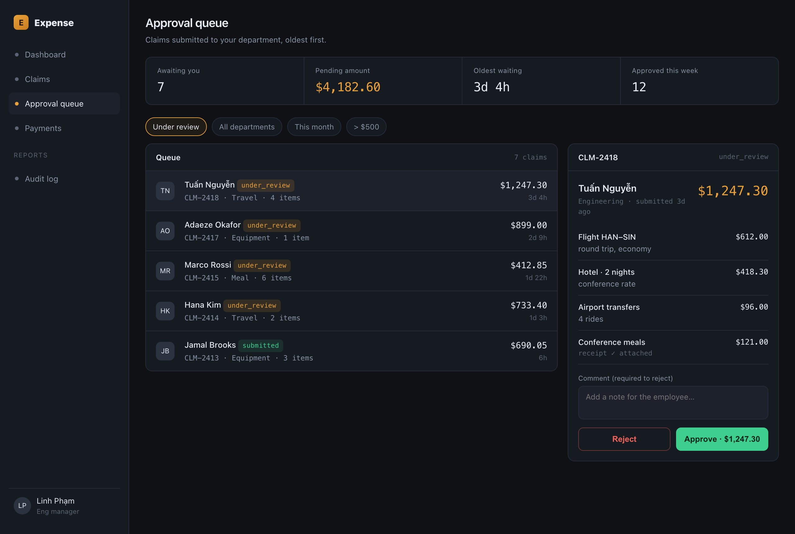
/ck:frontend-design Approval Queue screen for the expense approval app (desktop, dev-tool style).
  Sidebar nav + master-detail: pending claim list on the left, line-item detail + approve/reject
  buttons on the right. Status-colored badges. DESIGN_VARIANCE=4, VISUAL_DENSITY=8
The output upholds the key anti-slop rules: avoids Inter/Roboto, uses tinted off-black instead of pure black, a single gold accent, master-detail layout instead of three identical cards, copy that reads more realistic with varied names and natural unrounded numbers like $1,247.30. Badges for under_review / submitted are color-coded to match the state machine.
Step 3: Workflow walkthrough with preview --html --slides
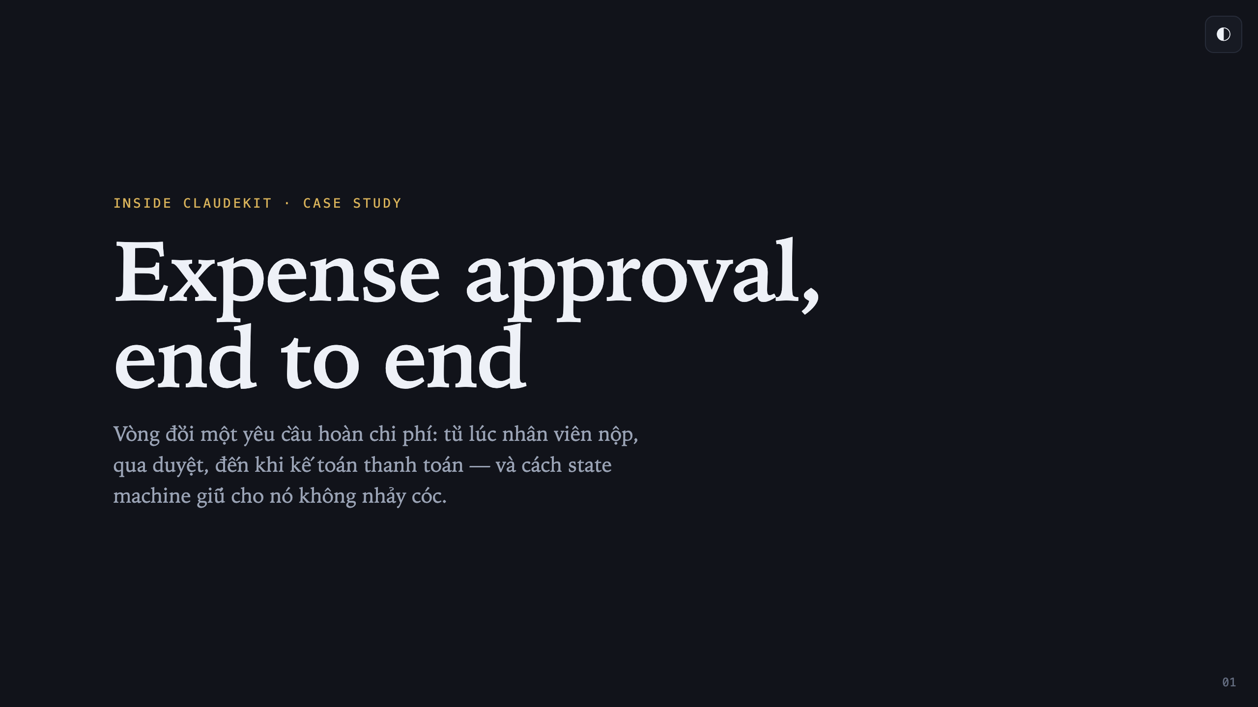
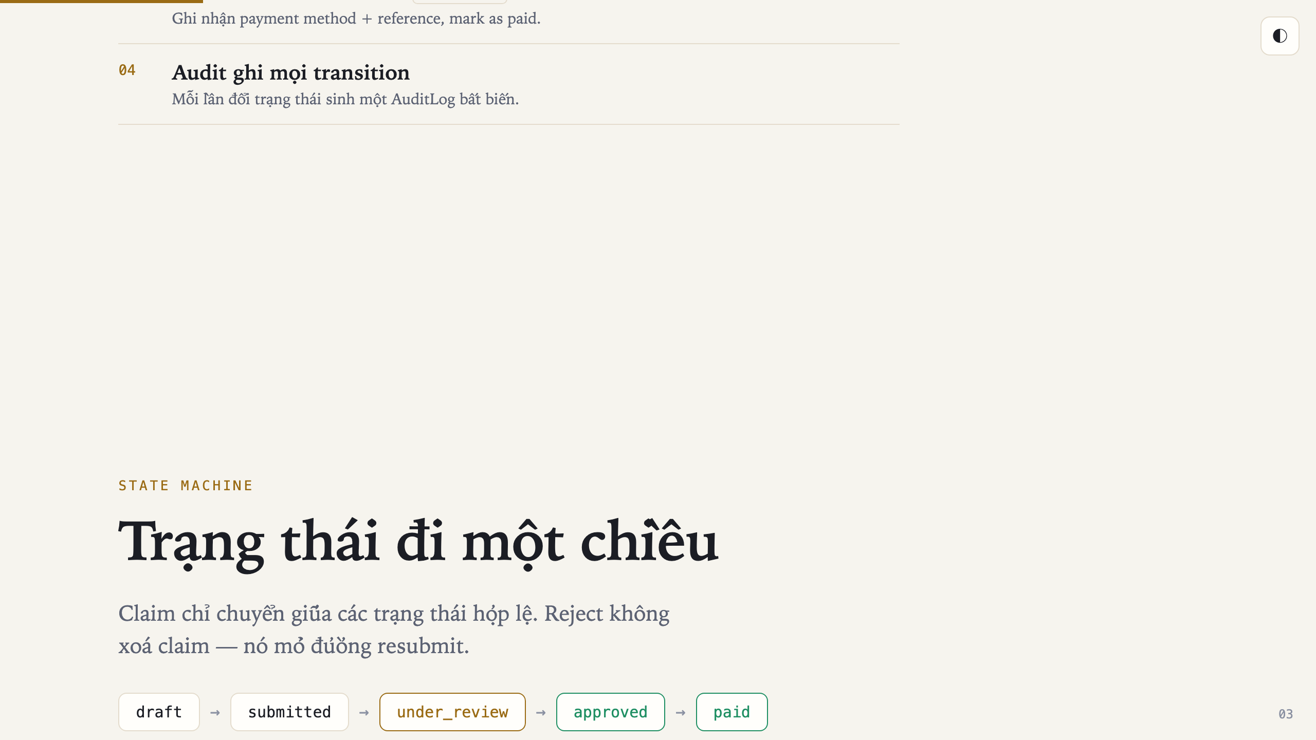
/ck:preview --html --slides "lifecycle of an expense claim: employee creates & submits → manager
  approves → accountant pays, with the state machine and 3 guardrails"
The viewport-fit deck uses the Midnight Editorial preset: serif, gold accent, dark navy. This style differs markedly from the Blueprint in Step 1, following the rule of varying aesthetics across outputs. The deck includes a progress bar, page numbers, and a theme toggle. Below is the title slide in dark theme and the state machine slide in light theme, demonstrating the toggle in action.
Step 4: Synthesis and showcase with show-off
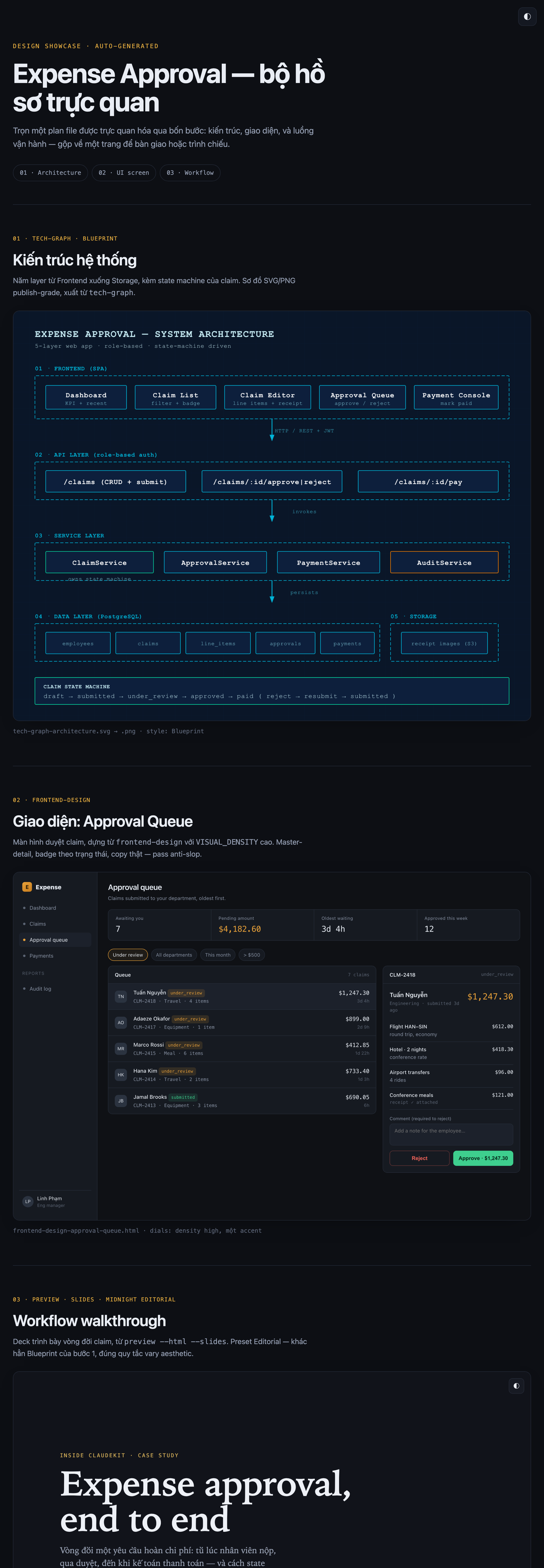
/ck:show-off Showcase page "Expense Approval — visual dossier", combining the architecture diagram
  (step 1), the Approval Queue screen (step 2), and the workflow slides (step 3) into sections
  with nav anchors, opening straight in the browser without a server.
show-off is the final synthesis step. It combines the diagram and UI screens into a self-contained HTML page. In this case study, images are embedded as base64 so opening a single file is all that is needed. The page includes anchor navigation, a footer crediting the skills used, and a theme toggle. Opens directly in a browser — no server required.
Token cost. The 4-step chain consumes significant tokens, since each tech-graph/frontend-design/preview/show-off is a separate output generation pass. If only a working draft for direction review is needed, return to Option 1.
04
Technical distinction: /ck:frontend-design vs /ck:stitch
At the UI-building step — Step 2 or Command 2 above — the deciding factor is whether a source design already exists, or whether Claude needs to infer one from scratch.
/ck:frontend-design is reproduction
Use when source design assets are already available: a Figma file, a sample screenshot, or a specific interaction flow. The skill treats the source as ground truth and reconstructs it in real HTML/Tailwind.
/ck:stitch is inference
Use when no reference design exists. The skill fills in the UI gap by inferring layout from functional logic, based on the nouns and verbs of the workflow.
| Situation | Skill | Nature |
|---|---|---|
| Has a screenshot/Figma/mockup to follow | frontend-design |
Accurate reproduction |
| Only a workflow description, UI inferred | stitch |
Inference and assembly |
3 important notes when letting AI infer the interface
- Lock down the screen list before generating. If skipped, the AI tends to add extra screens outside the intended scope, wasting tokens and diluting the main flow.
- Declare Design Dials up front. Set
DESIGN_VARIANCE,VISUAL_DENSITY, andMOTION_INTENSITYin the first invocation so screens remain aesthetically consistent. - Keep the anti-slop guard active. Block default Roboto/Inter fonts, template purple-blue gradients, three identical evenly-spaced cards, neon glow, "John Doe", and Latin placeholder text.
One note that applies to both: they block generic copy like "John Doe", round numbers, and clichés, but real copy still needs a human writer or reviewer. The skills do not fabricate domain-accurate content on their own.
05
Prerequisites and pitfalls
Before chaining skills into a sequence, check dependencies first. All skills live in ClaudeKit, but runtime environments have their own requirements: tech-graph needs a binary to export SVG/PNG (rsvg-convert), stitch needs an API key/quota for the corresponding service, show-off needs a Puppeteer-capable environment for screenshots. Missing one piece leads to hard-to-predict errors: no image output, jobs stalling mid-run, or vague log messages. Checking upfront saves considerable back-tracking time.
- Typing flags for
show-off/tech-graph/stitchlike CLI commands. They are prompt-driven; flags belong to internal scripts. - Assuming
show-offauto-scans existing assets. Assets must be provided to the mission; the skill does not search for them. - Calling
preview --diagram <path-to-plan>. It accepts a topic string, not a file path; the flag goes before the topic. - Letting
stitchgenerate without locking the screen list first. Output tends to include extra screens and wastes tokens. - Forgetting that slide presets (4) differ from HTML page presets (6). Blueprint and Paper-Ink are not available for slides.
- Using
frontend-designto produce explanatory documentation. Output is typically too aesthetically heavy for a reading-focused purpose.
Summary
Choose by output purpose
Thinking → preview.
Product → frontend-design.
Standalone file → tech-graph.
Embedded in markdown → mermaidjs-v11.
Inside an HTML page → preview --diagram.
Yes → frontend-design.
No → stitch.
show-off is a self-contained pipeline.
Combine in order:tech-graph + frontend-design/stitch + preview --slides + show-off.
Internal explanation → preview/preview --slides.
UI review → frontend-design/stitch.
Sendable handoff → show-off.
The brainstorm → brainstorm --html.
The plan → plan --html.
ClaudeKit's visualization layer has no universal button, but it is not complicated when viewed through the lens of roles. It revolves around two axes — orchestration and execution. Start by deciding what job the output has: internal explanation, UI review, or a sendable handoff. Then select the satellite skill based on the required output format. When the problem spans multiple capability clusters, combine them in the correct order as demonstrated in the Section 03 case study, rather than forcing one skill to do another skill's job.